Your freelance web design and Webflow partner - based in Finland
Pg Humane Society
Challenge
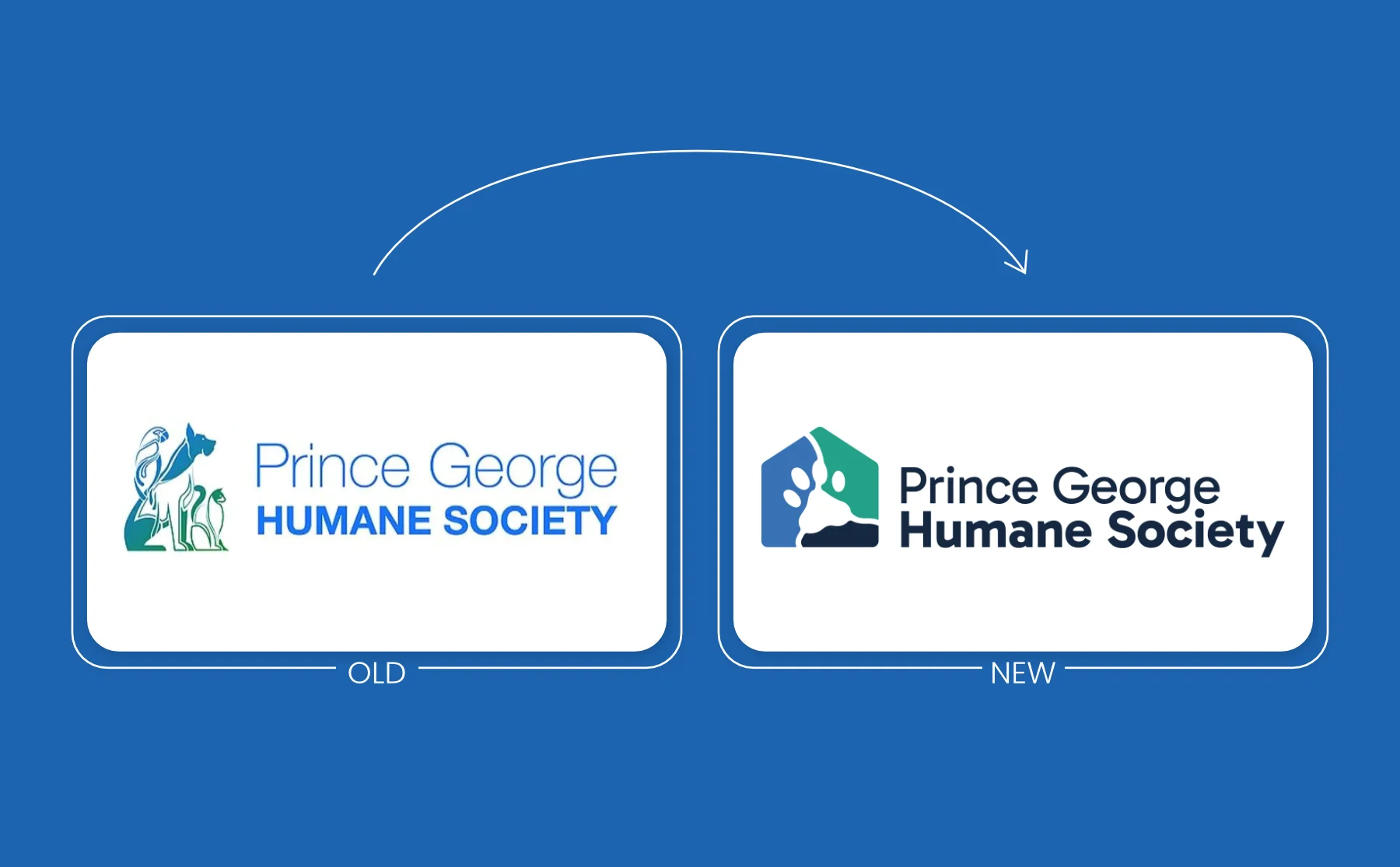
The Prince George Humane Society sought a pro bono rebrand to modernize its visual identity without straining resources. Their existing brand was held back by an overly detailed logo that lacked scalability, making small-format print applications functionally impossible. A key constraint was retaining the shelter’s recognizable, physically-painted core colors, despite their poor contrast on digital platforms causing web accessibility issues. The goal was to create a sophisticated, highly scalable identity that honored local heritage while optimizing the color palette for both enhanced web accessibility and compatibility with the shelter’s physical environment.
Action
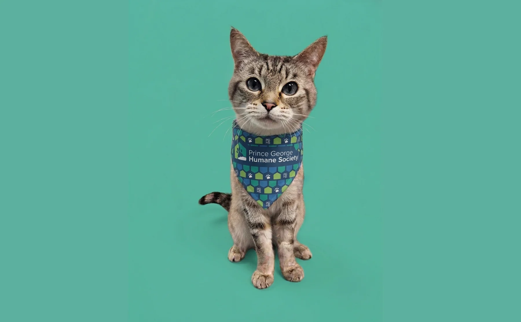
- Redesigned Logo: Stripped away unnecessary detail to create a sleek, minimalist mark designed to perform seamlessly across all scales—from large signage to small t-shirt chest prints. Embedded a subtle local motif into the design: the shape uniquely showcases the iconic confluence of Prince George’s two rivers (the Fraser and Nechako rivers).
- Color Palette Modernization: Retained brand recognition by building directly upon the original brand colors while elevating versatility and compliance:
- Introduced a grounding Dark Navy Blue to add weight, structure, and professional flexibility.
- Added a Vibrant Lime Green to serve as an energetic accent color.
- Subtle tone adjustments to the primary Teal, darkening it specifically to meet modern web contrast and accessibility standards against plain white backgrounds.




Action
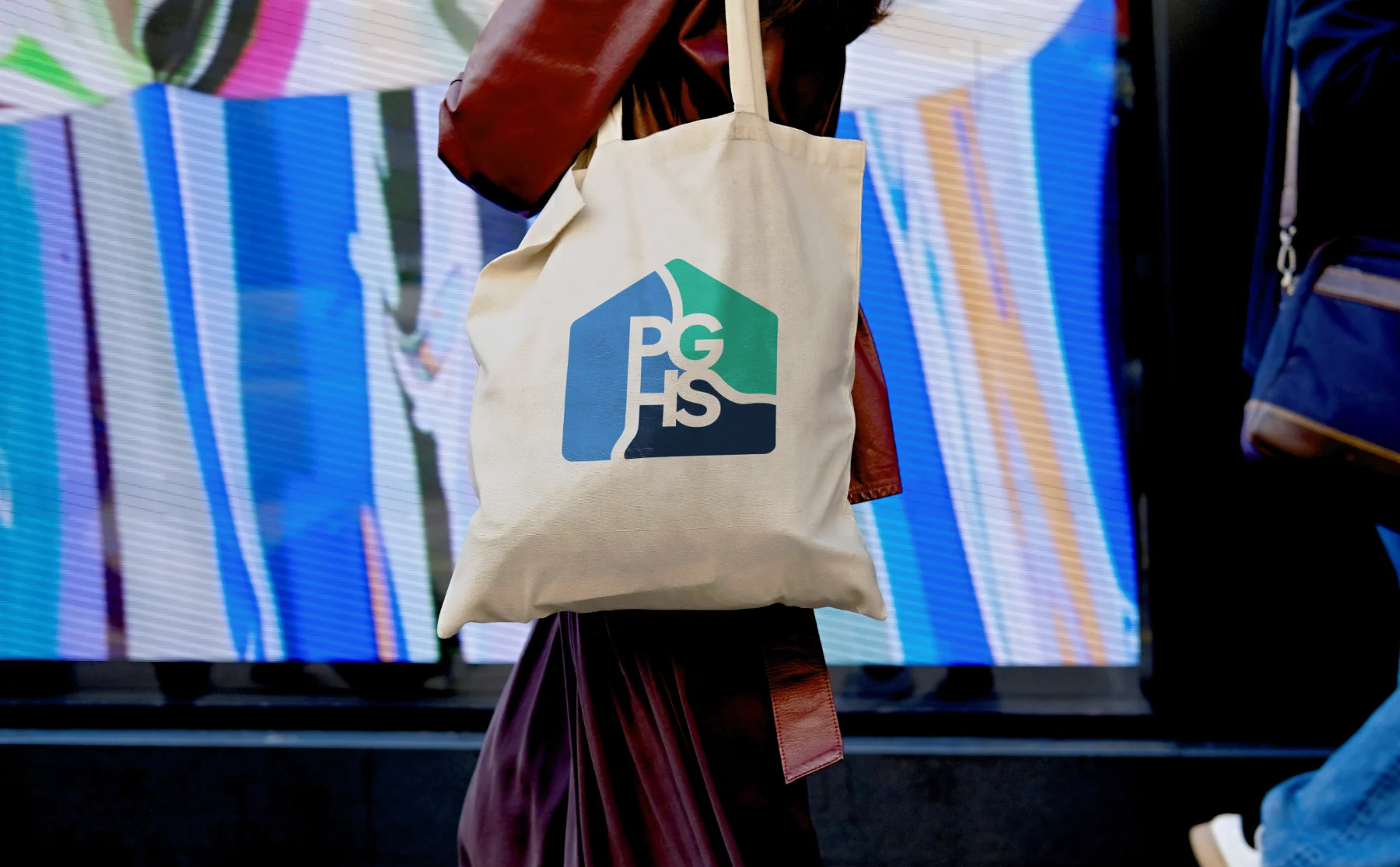
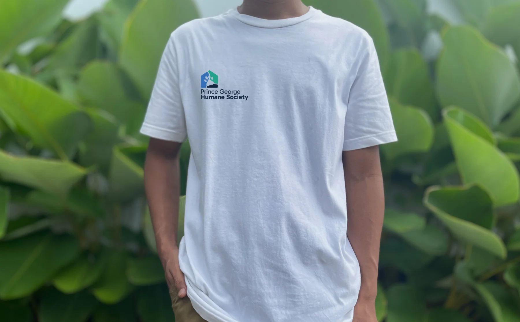
- Redesigned Logo: Stripped away unnecessary detail to create a sleek, minimalist mark designed to perform seamlessly across all scales—from large signage to small t-shirt chest prints. Embedded a subtle local motif into the design: the shape uniquely showcases the iconic confluence of Prince George’s two rivers (the Fraser and Nechako rivers).
- Color Palette Modernization: Retained brand recognition by building directly upon the original brand colors while elevating versatility and compliance:
- Introduced a grounding Dark Navy Blue to add weight, structure, and professional flexibility.
- Added a Vibrant Lime Green to serve as an energetic accent color.
- Subtle tone adjustments to the primary Teal, darkening it specifically to meet modern web contrast and accessibility standards against plain white backgrounds.